August 9, 2011
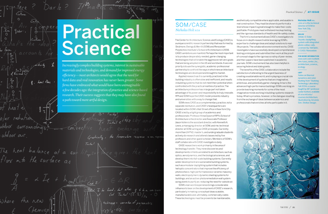
We are pretty excited about our redesign of ArchitectureBoston magazine. Although we've been making gradual refinements to the existing design over the last few years, the redesign was fully realized in the current Fall 2011, Science. Our goal was to re-energize the layout to reflect the caliber of the content, while still maintaining a well-respected brand. To do this, we introduced a flexible grid that allows for more dynamic white space and larger imagery. The magazine also underwent a thorough refining of details, from the logo and title treatments, down to the folios.
One of the most scrutinized decisions was the selection of the new text typeface. We sought to find an extremely legible yet innovative face that fits more words per line than most serifs, and makes reference to Boston's history. With those requirements in mind, we eventually landed on Whitman. Designed by Kent Lew and distributed by Font Bureau (our neighbor in Fort Point), this serif face draws inspiration from revered designer, W.A. Dwiggins. Like Boston itself, the typeface has a traditional core with contemporary details.
It's worth noting that the cover features an installation by another one of our favorite clients, artist Ralph Helmick. We like it when that happens!

